Building Power
Brand Identity
The Story
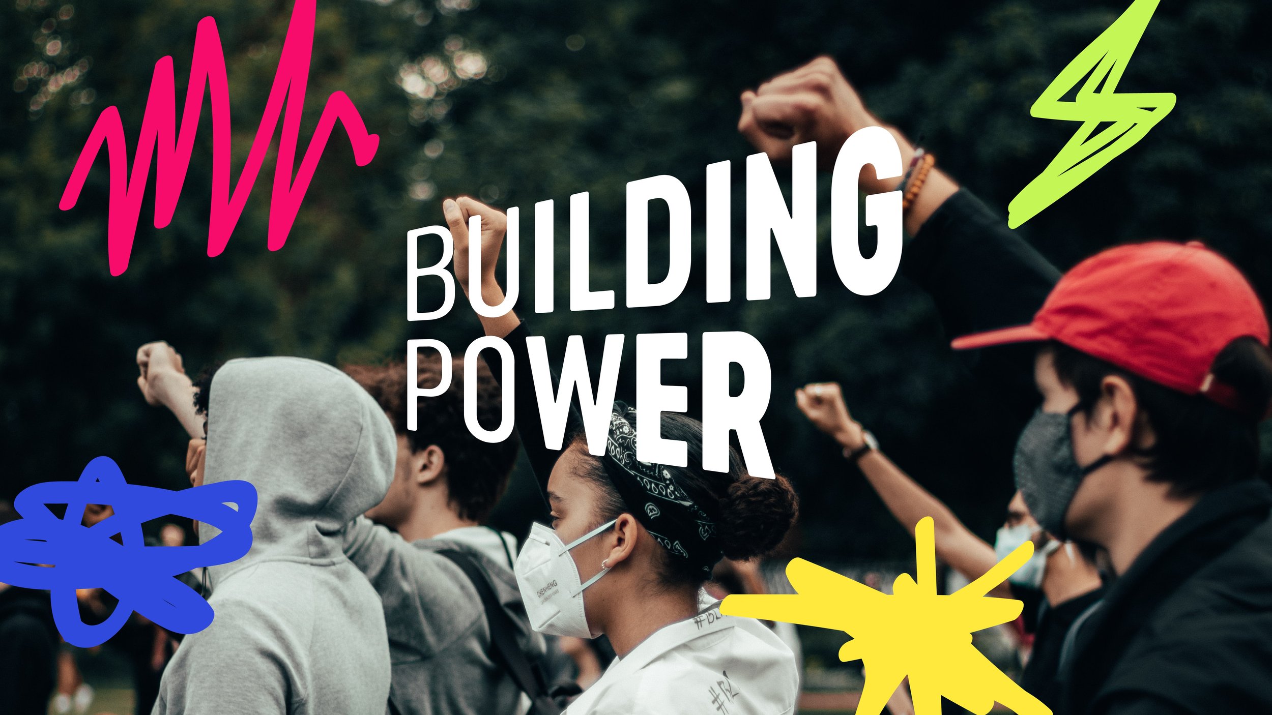
A loud and outspoken brand for a bold new Youth Advocacy Program. Building Power - the youth arm of The 519 - is connecting and uplifting the next generation of 2SLGBTQIA+ advocates through workshops, courses and other programming.
Cause
2SLGBTQIA+ Advocacy
Youth Futures
Services
Logo Design
Brand Identity
Social Media
Details
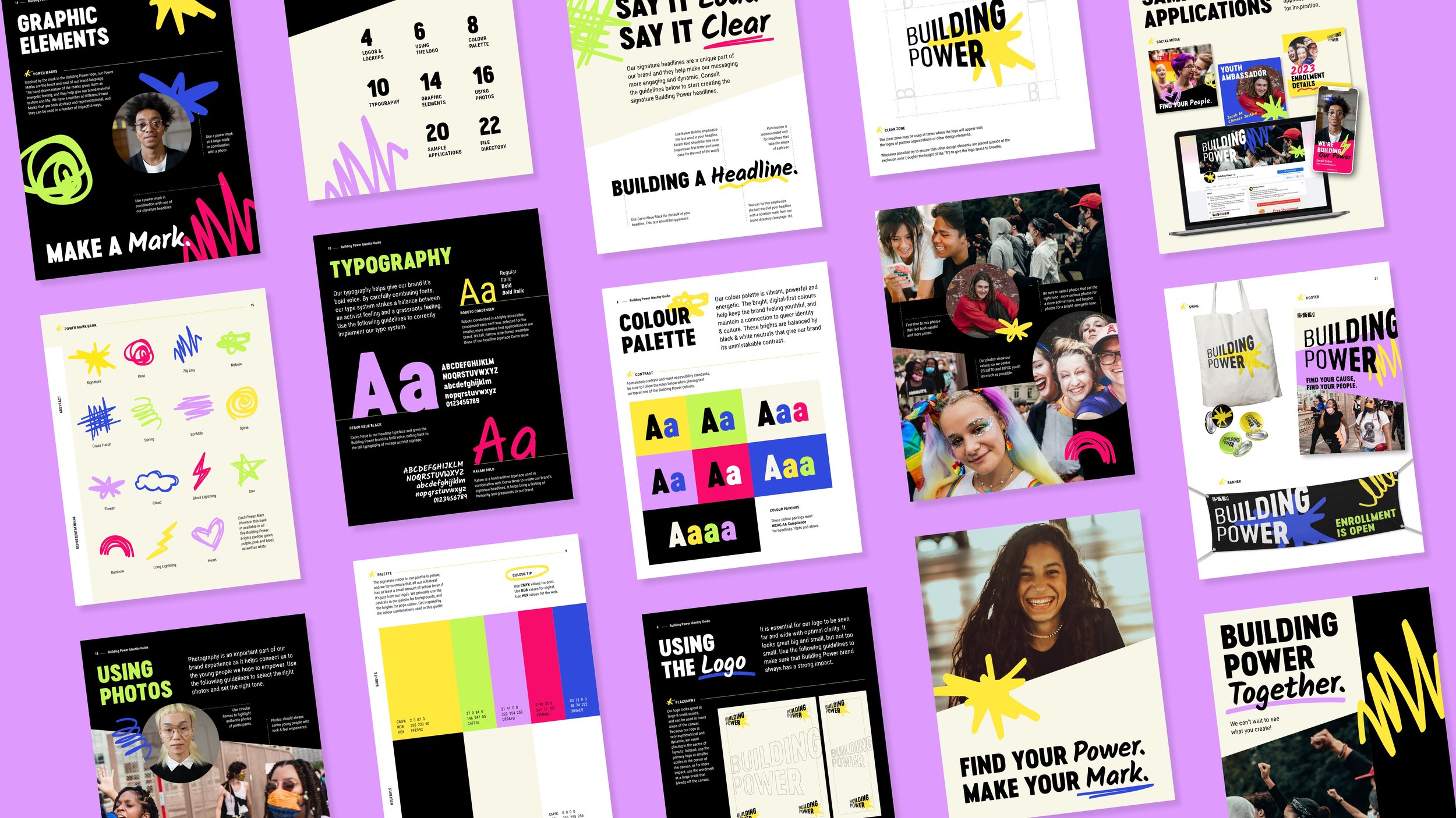
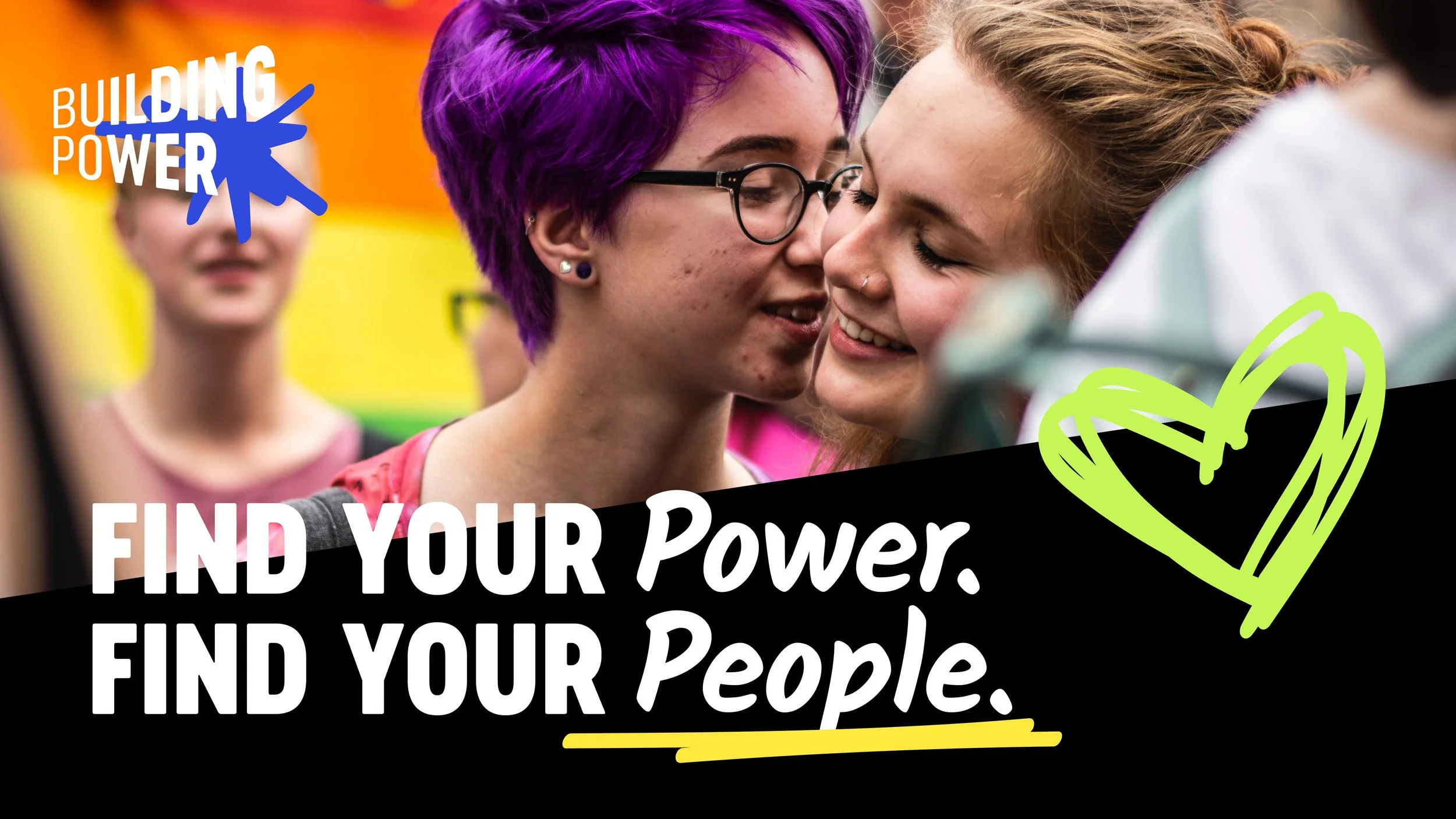
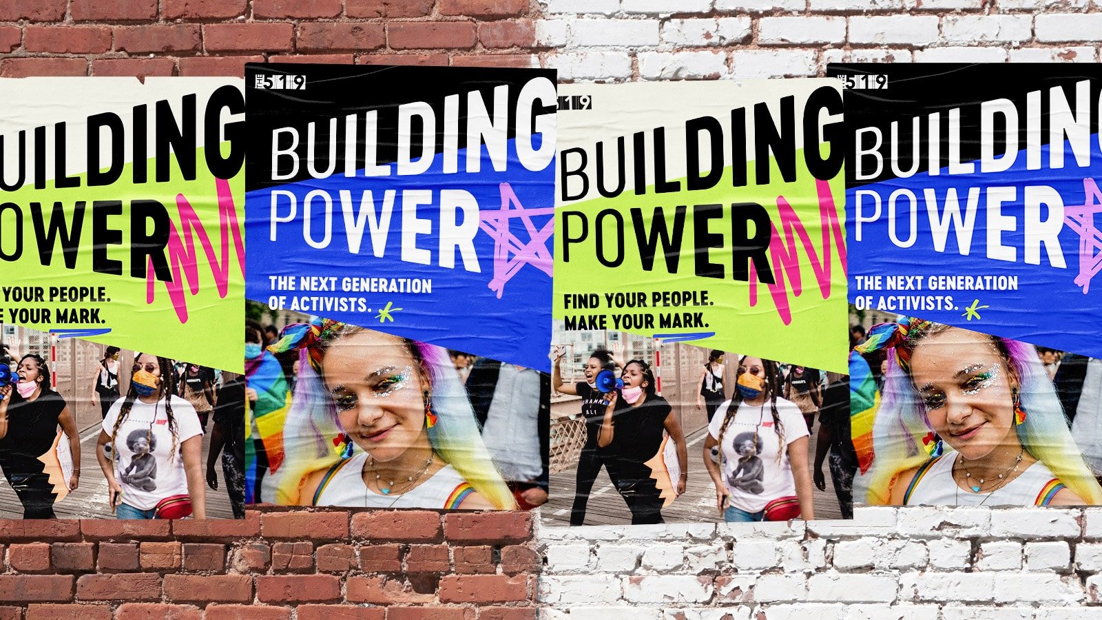
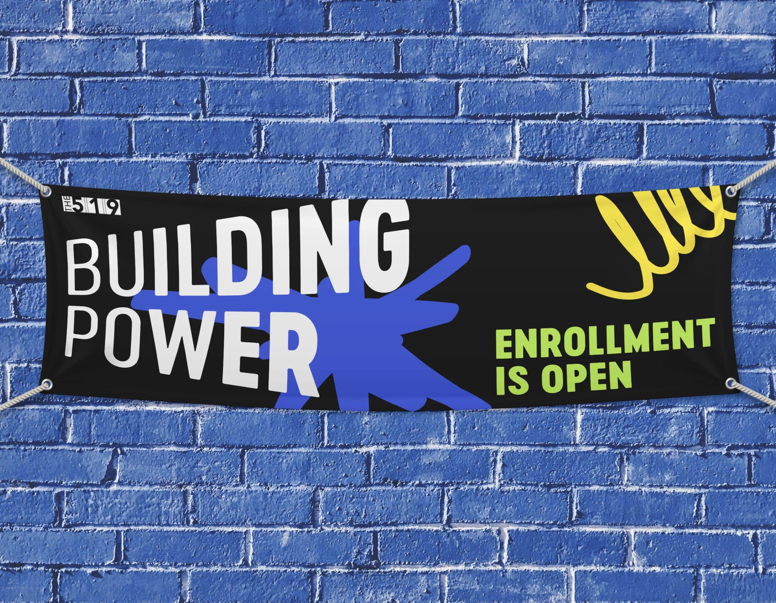
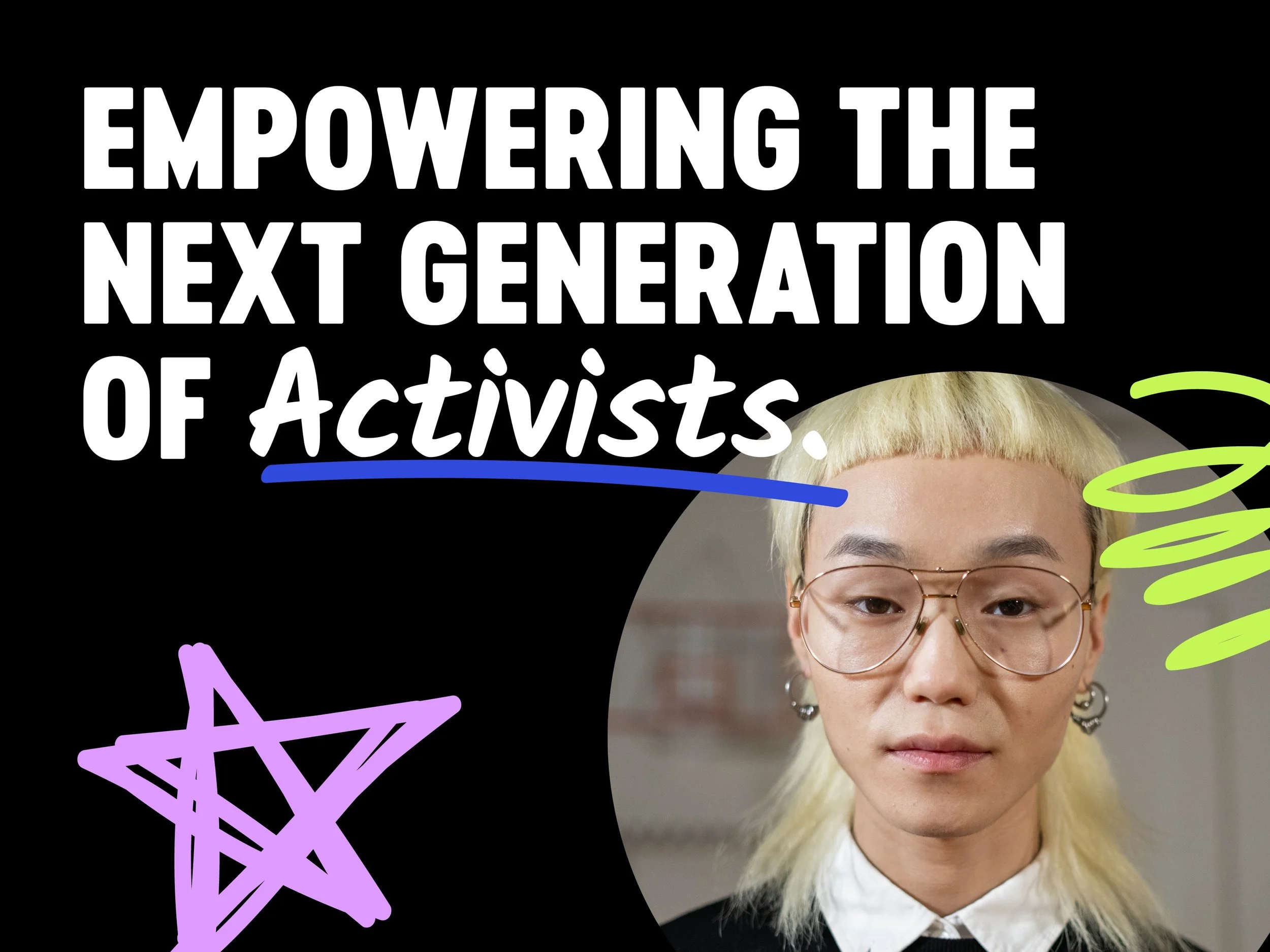
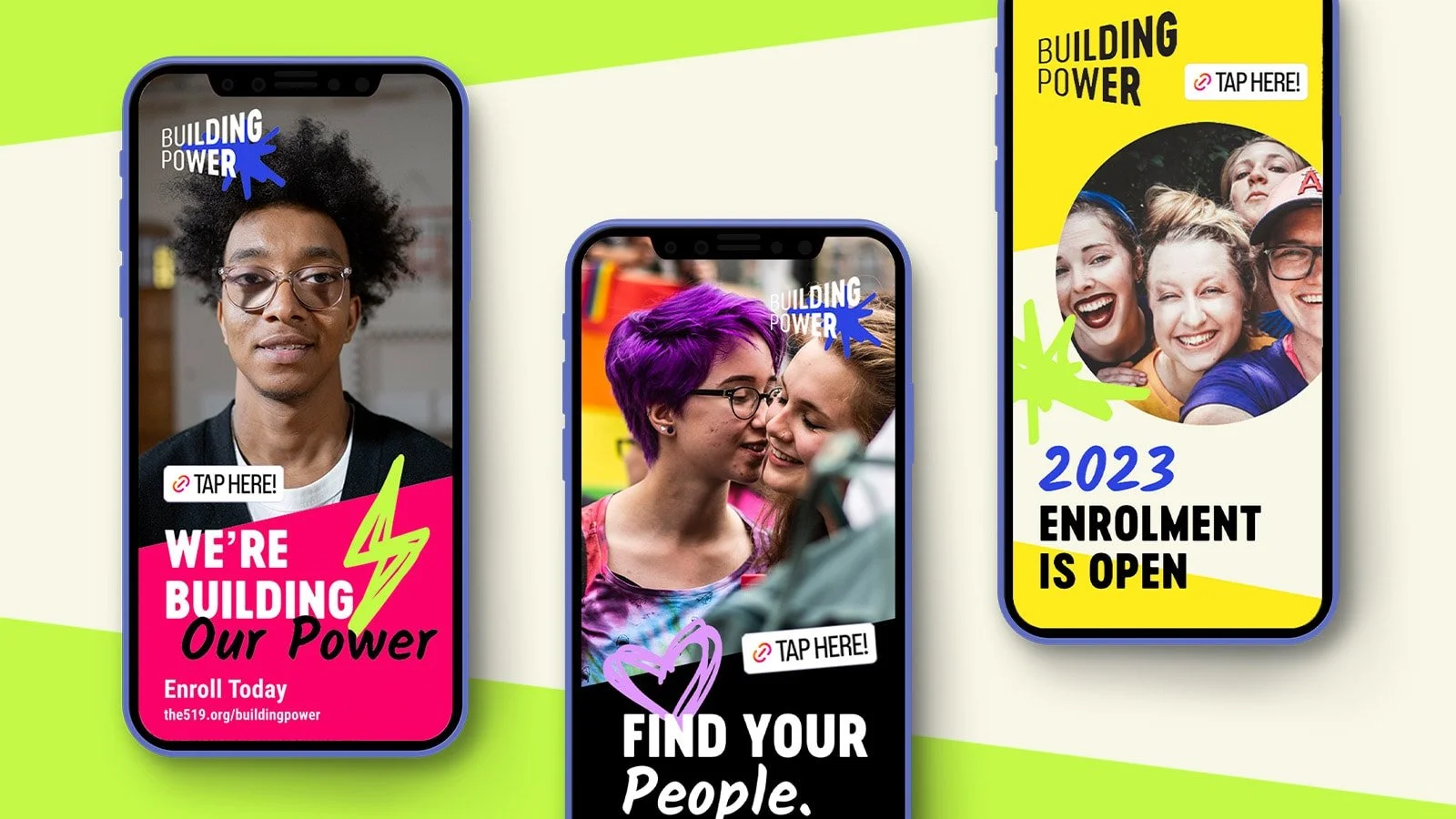
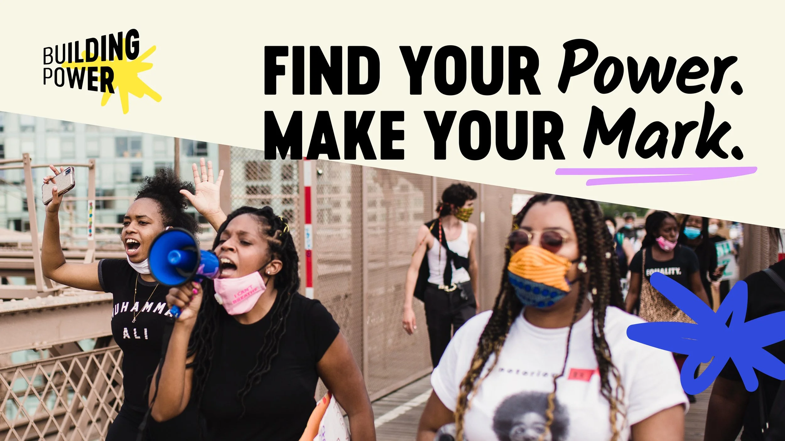
The Building Power brand capitalizes on the energy and colour from existing 519 campaigns, with a stronger, more youthful graphic language. A vibrant, digital first colour palette gives the brand a unique energy while keeping queerness at the forefront. The addition of dynamic, variable typography and stark black and white backgrounds also give the brand its signature contrast.
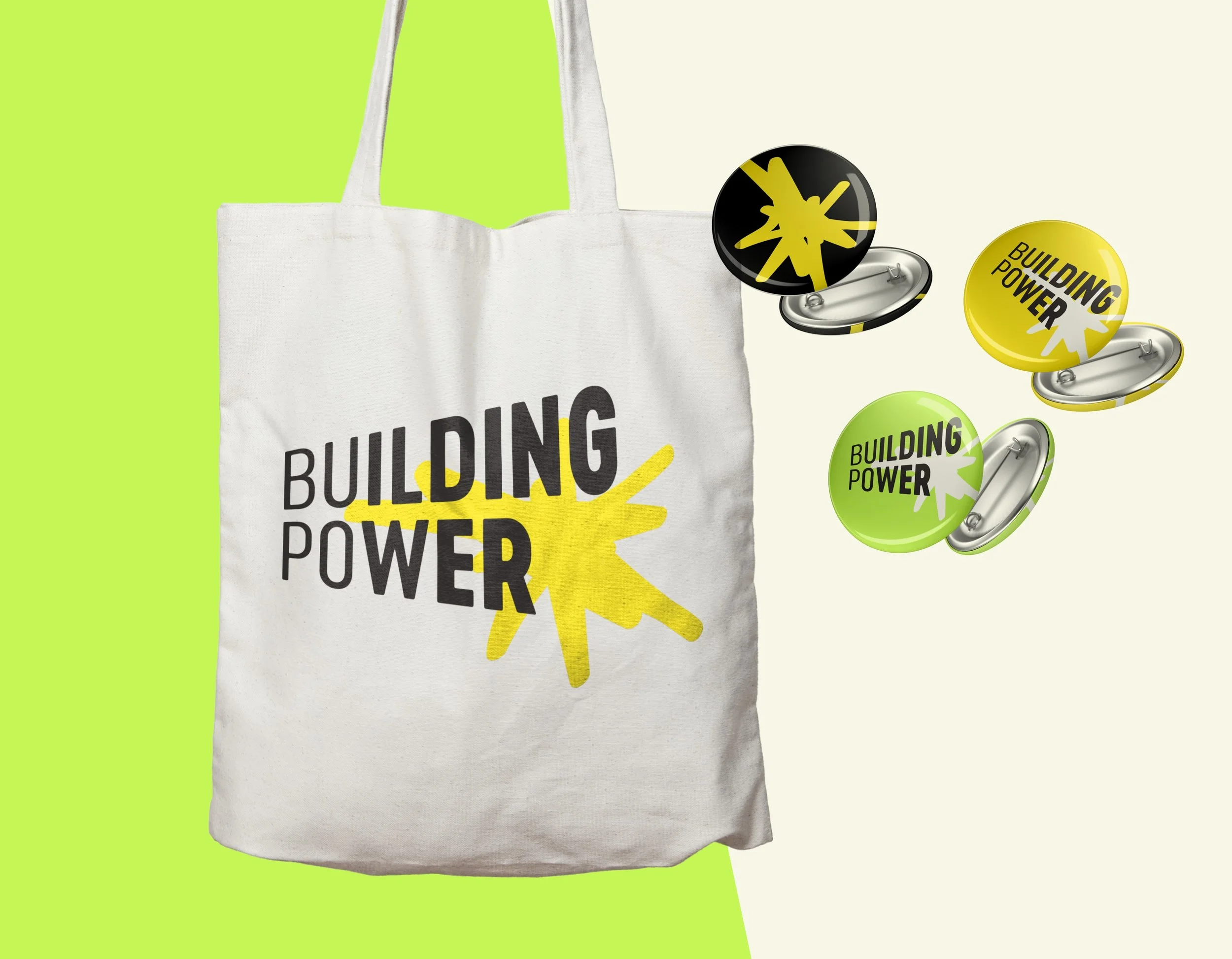
The Building Power logo helps capture the organizational mission by creating a feeling of forward momentum, achieved by combining letters of increasingly heavy weights in a shape that is getting increasingly wide. The wordmark culminates in a bold, hand drawn mark that gives the heavy type more energy, and becomes the organizational icon. The overlapping lockup and bold black and yellow colour combination ensure the logo is unique and eye catching to its audiences.
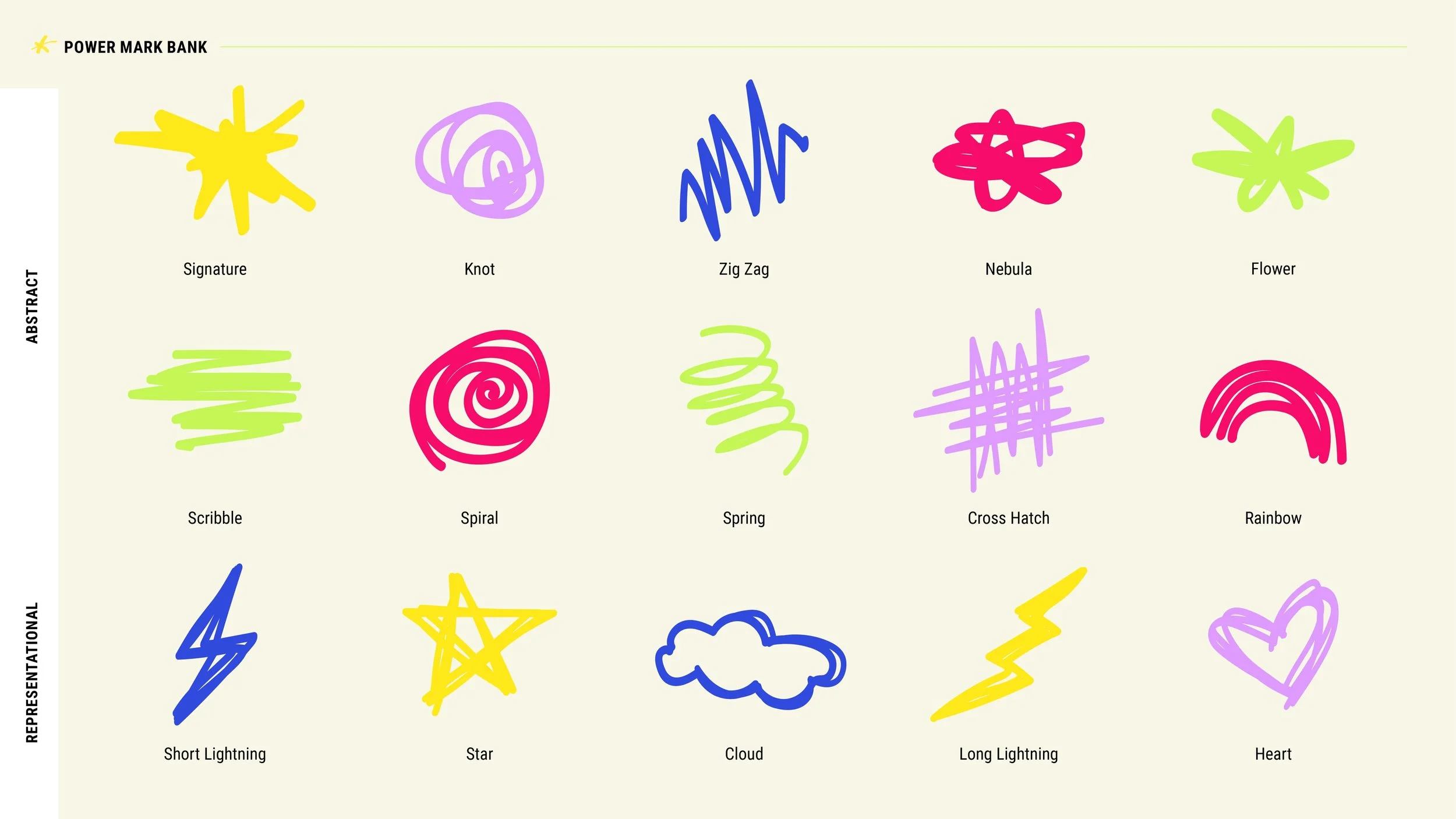
The brand's "Power Marks" are the heart and soul of the visual language. Their hand-drawn nature gives them an energetic feeling, and they help give brand material texture and life. The marks are both abstract and representational, and they can be used in a number of impactful ways.


Project created at Loop: Design for Social Good