Qupanuaq
Brand Identity & Website
The Story
A nurturing and culturally connected brand & website for a youth-focused support network. The Qupanuaq initiative at the Arctic Children & Youth Foundation is addressing systemic challenges and empowering families and communities in Nunavut by leveraging existing government support and creating community connection.
Cause
Youth Futures
Reconciliation & Indigenous Sovereignty
Services
Logo Design
Brand Identity
Brand Collateral
Illustration
Web Design
Details
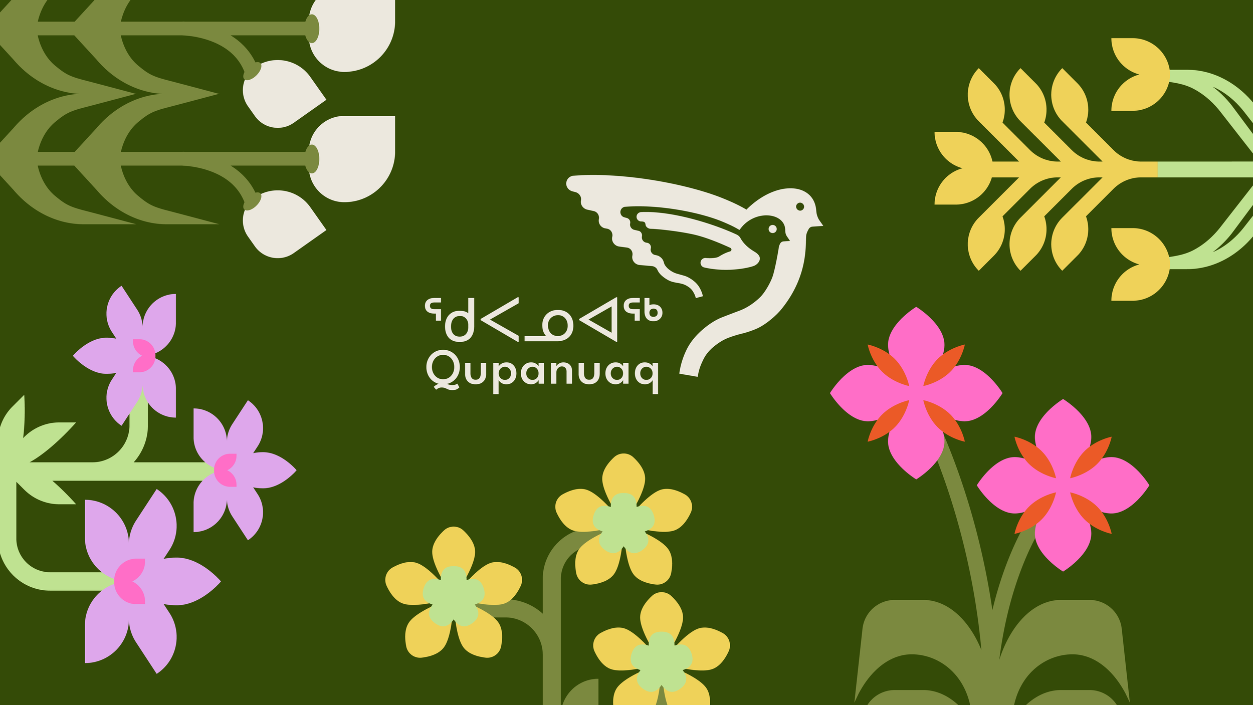
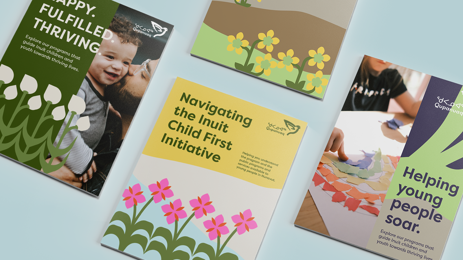
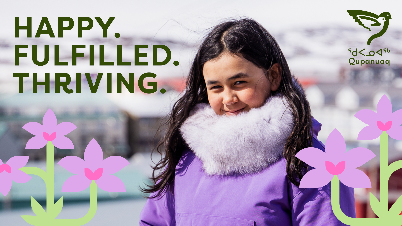
Above all, the Qupanuaq team needed the branding for this new initiative to resonate with the community it serves, making input, research, and discovery key to the brand’s foundation. Just like the flora of Nunavut blooming in the Tundra, Qupanuaq’s goal is to provide children with the resources they need to become happy, thriving young people. The brand brings this theme to life through natural metaphors derived from the Nunavut landscape, visually connecting the to the ideas of growing and thriving.
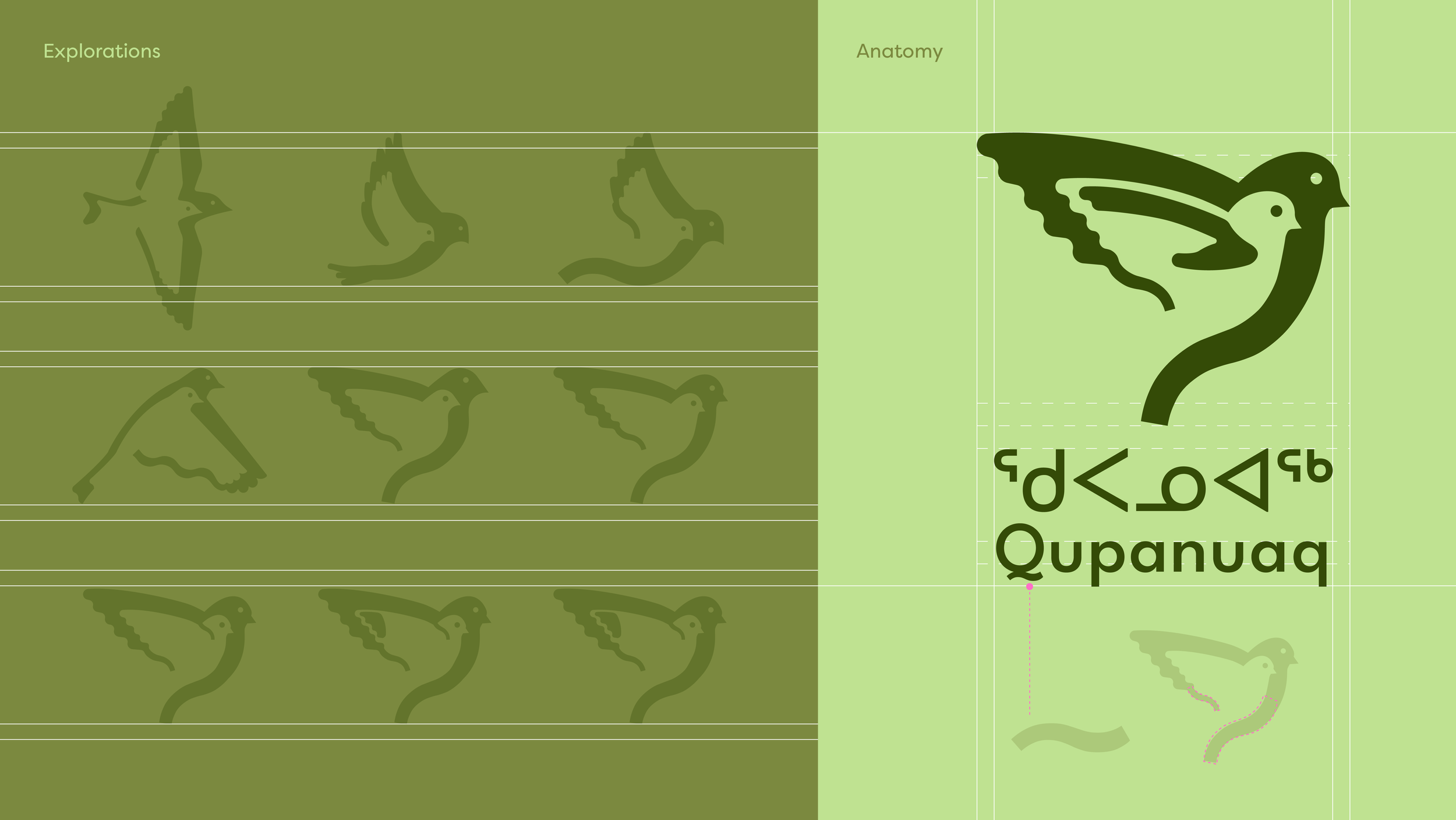
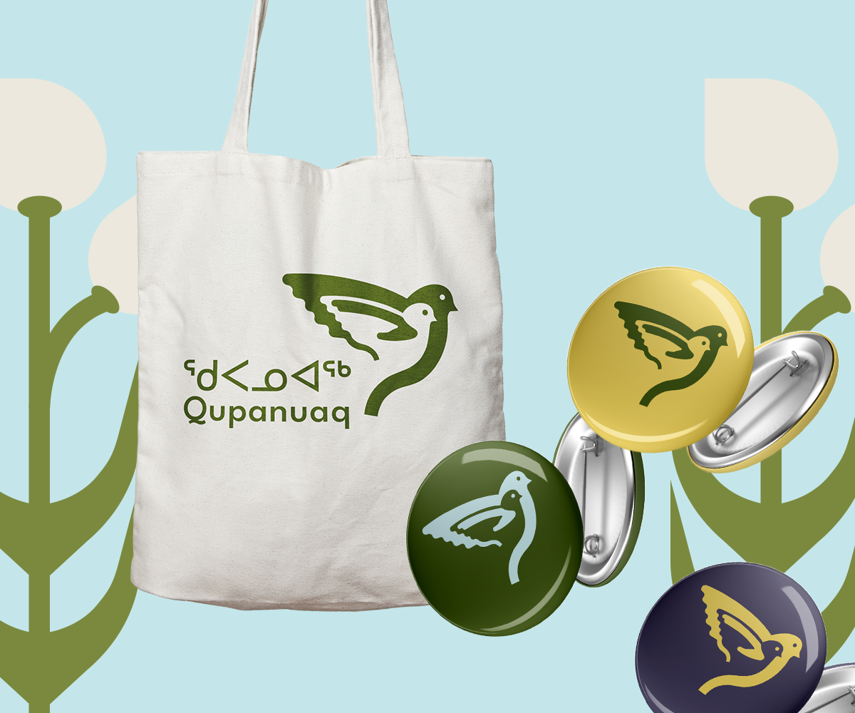
Inspired by the flight of the Qupanuaq (Inuktitut for the “snow bunting” bird), the logo uses strong geometry to create an impactful silhouette that represents the initiative and its mission. The design cleverly utilizes negative space to feature two Qupanuaqs flying side by side, capturing both the idea of a carer and a child, or a smaller bird growing into a larger, thriving bird. The icon creates a sense of harmony with the round, geometric shapes in the Inuktitut letterforms, and the tail of the wordmark’s capital “Q” has been isolated and thoughtfully integrated into the wing and tails of the birds. This rounded geometry is continued throughout the brand’s type system.
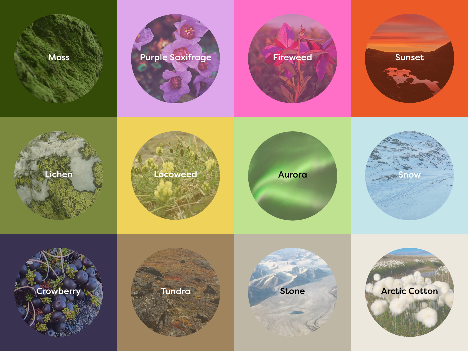
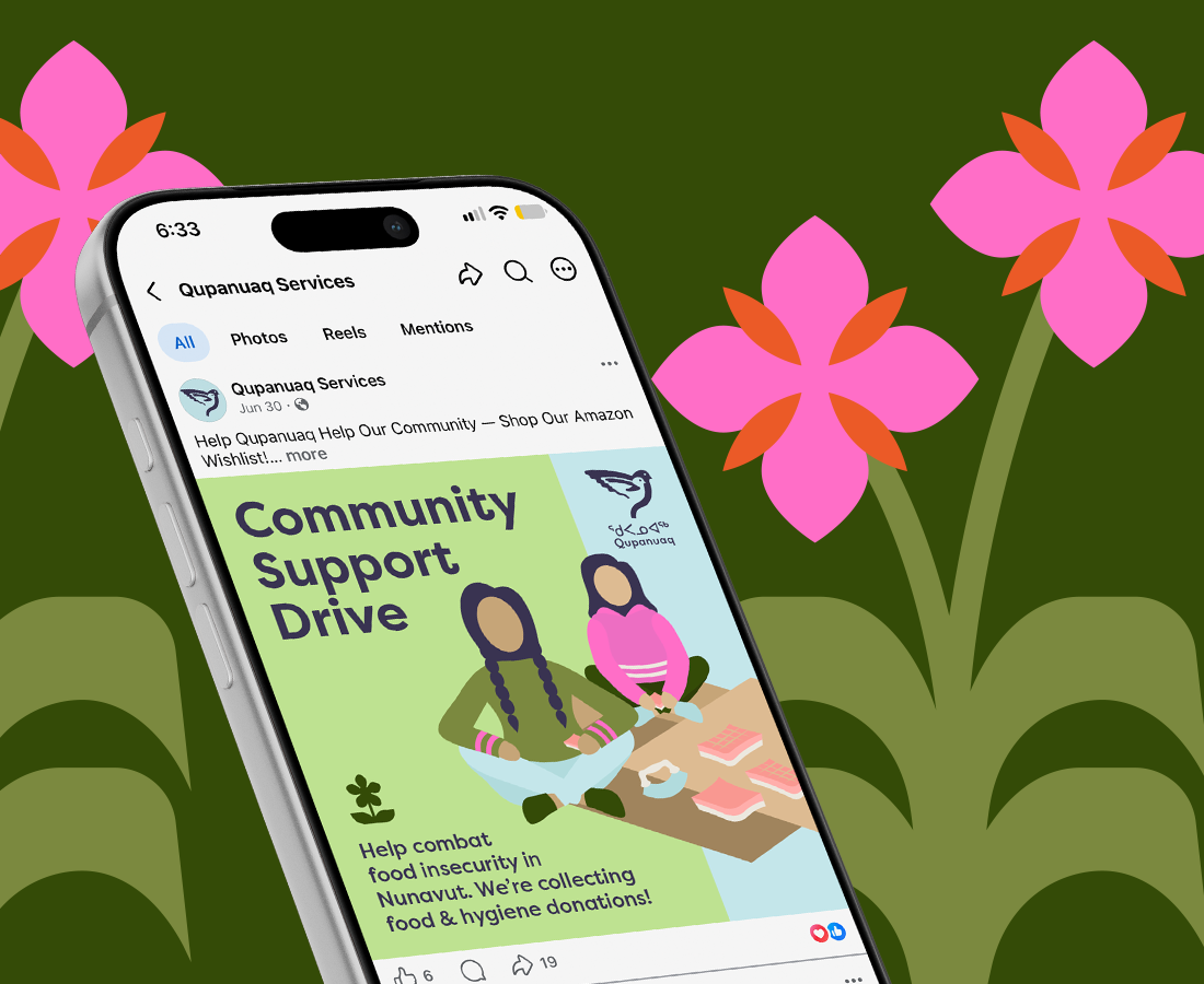
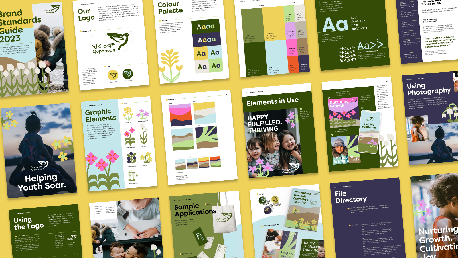
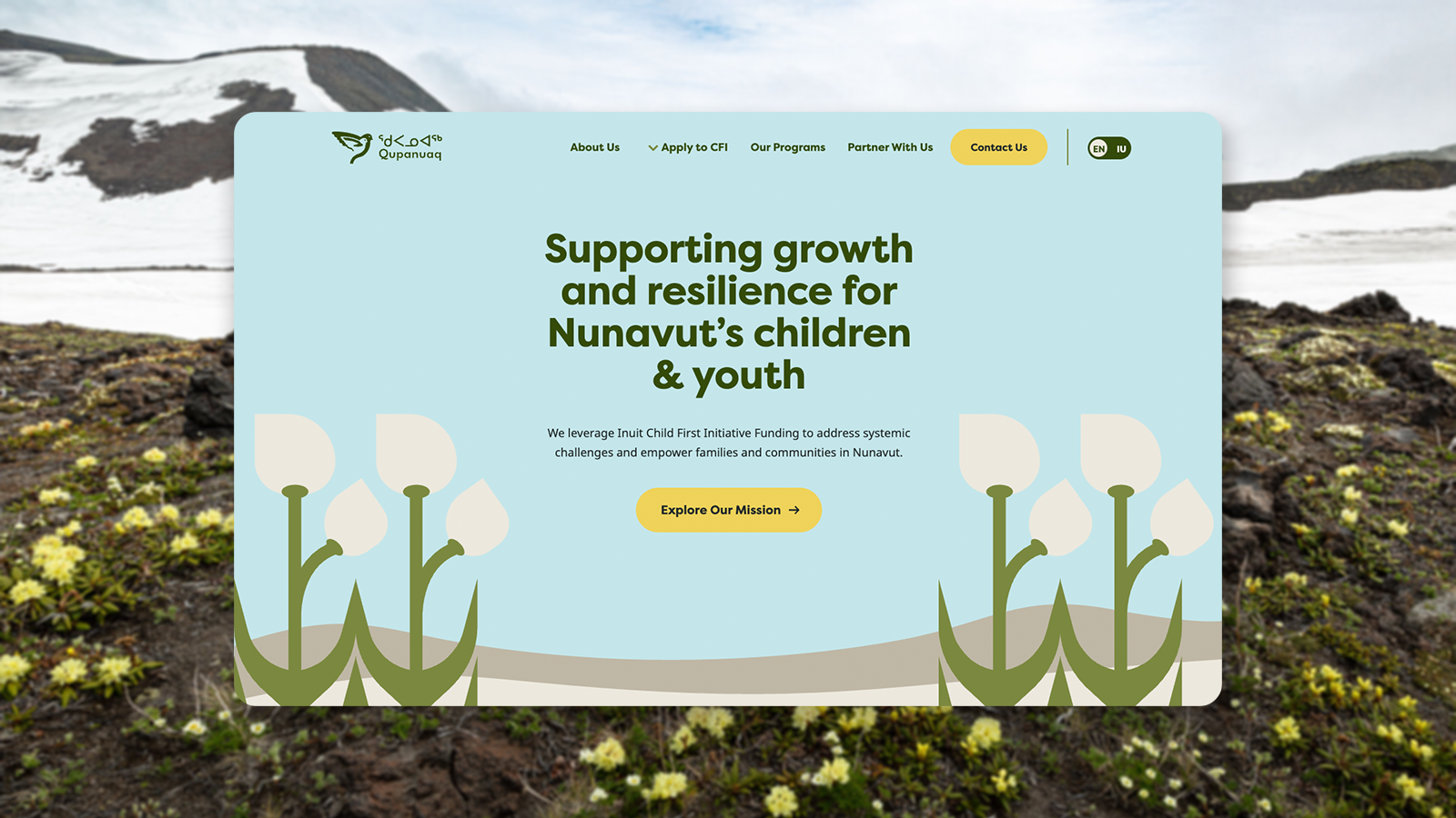
The brand palette is inspired by the land of Nunavut, and can be toned up and down depending on the use case. The neutrals, greens, and blues set a more institutional tone where appropriate, while the brighter colours add a pop of fun and youthfulness. The connection to land is continued through the brand’s graphic elements, comprised of floral illustrations and landscape motifs that capture the distinct look and feel of Nunavut, including fireweed, saxifrage, arctic cotton, crowberries, locoweed, sunsets, tundra, and aurora. The featured flora helps infuse the brand with deeper meaning, like the resilient Purple Saxifrage - the first flower to bloom in spring, and one of the most northerly flowering plants in the world. Or Arctic Cotton - dispersing through the wind and connecting to the idea of spreading resources and community connection.
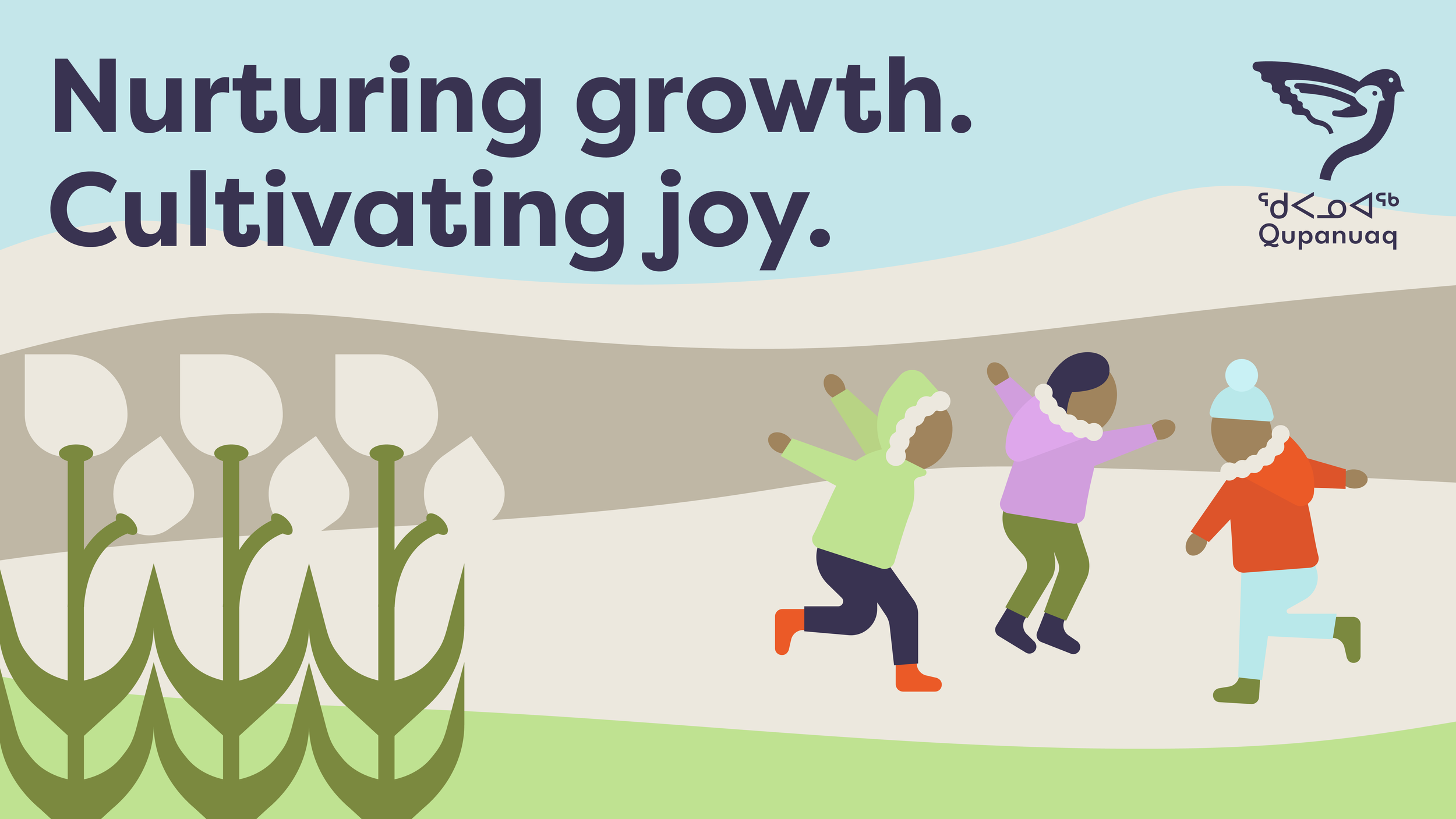
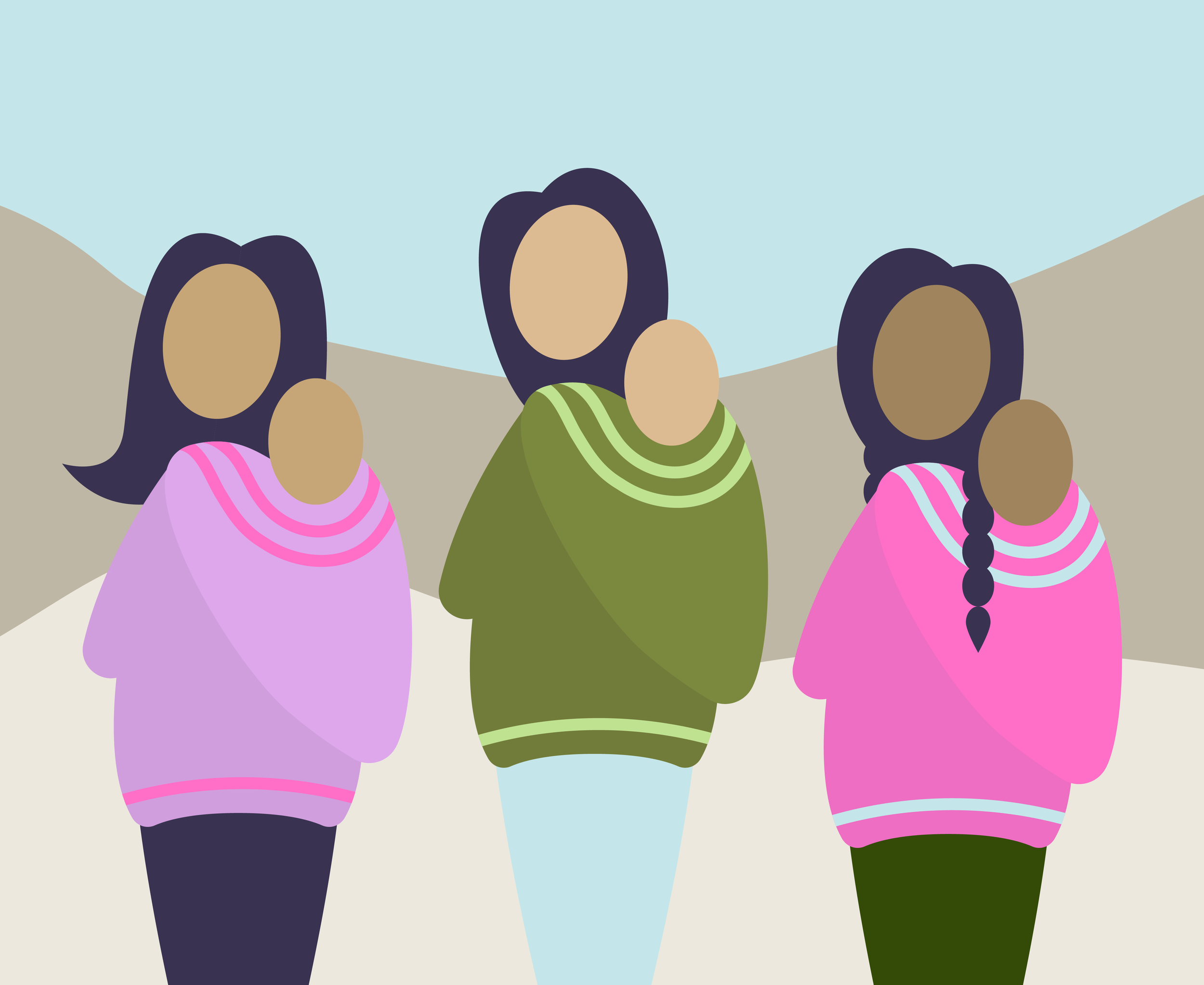
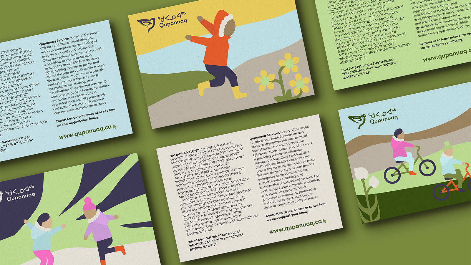
In 2025, the brand was extended to include a new illustration bank of youth and carers in uniquely Inuit clothing to bring a human connection to the brand when photography was not available. The dynamic illustrations of joyful children running, jumping and cycling have become particular brand favourites.
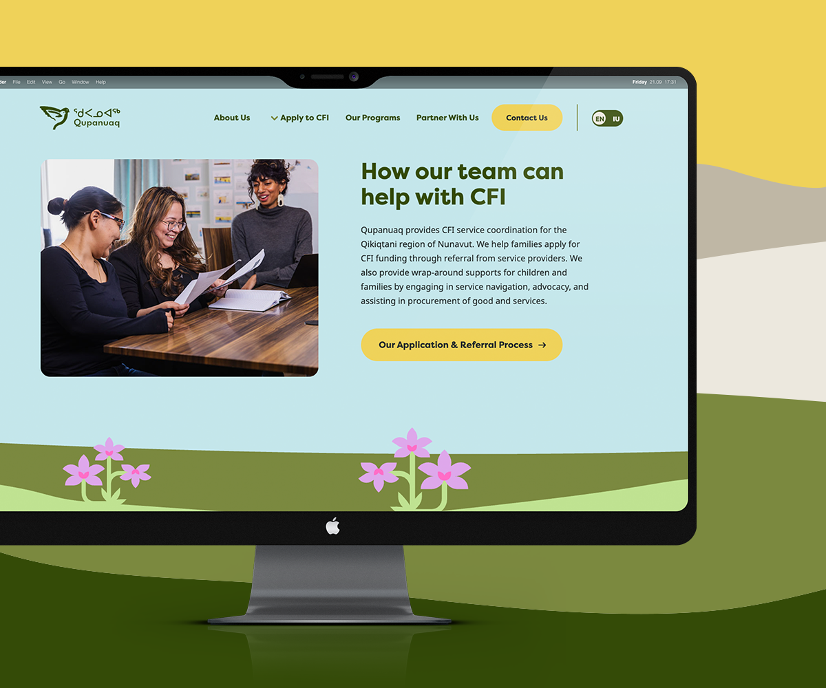
The Website
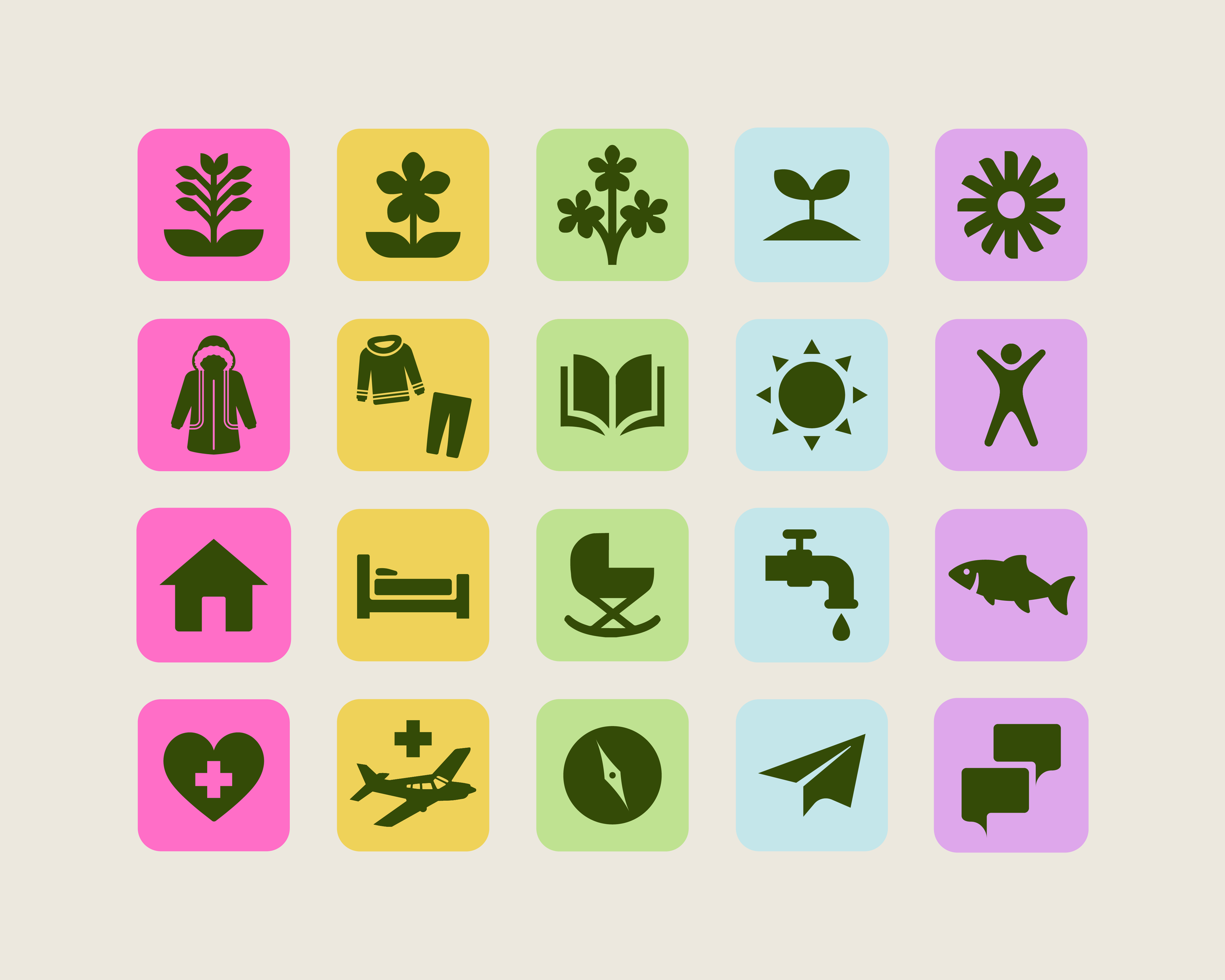
The Qupanuaq website is above all a tool for the team to help clarify their mission and process. Their primary goal is to assist families who are navigating the Government of Canada’s Inuit Child First Initiative, a federal program that ensures Inuit children across Canada have equal access to essential, government-funded health, social, and educational supports. Like many government programs, it can be complex and time consuming to navigate, and the Qupanuaq team act as skilled intermediaries, connecting families and carers with the right people and paperwork to receive the support they are seeking. On top of this crucial work, they also run local programs in partnership with other organizations to provide their community with things like food boxes, winter coats, beds & cribs, eyeglasses, therapy, and so much more.
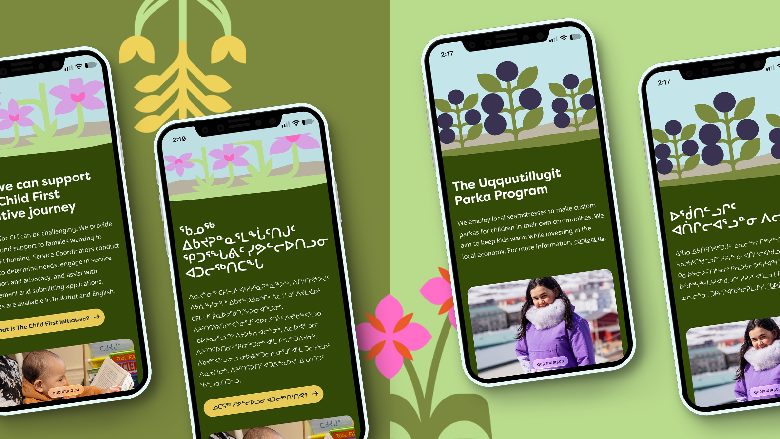
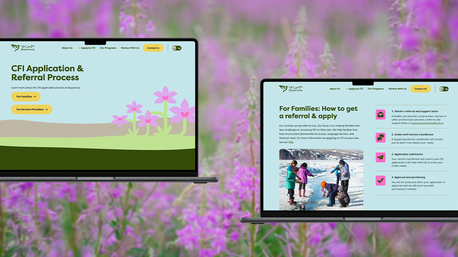
The website brings these two key service offerings into focus through dedicated pages. Information that could be overwhelming or confusing is presented in the form of checklists with clear action items and next steps. Each program has a brief and succinct description with relevant links to partner pages or facebook groups, connecting the local community. The website also provides transparency about how the initiative is run and who is running it, an important piece in connecting with potentially marginalized families. And to ensure the website serves the whole community and not just those who speak English, the whole website is also available in Inuktitut.
Project created at Loop: Design for Social Good