Community Forests International
Brand Identity

The Story
A vibrant and passionate brand as exciting as the organization behind it. Community Forests International is dedicated to conserving and rejuvenating forests in Atlantic Canada and Zanzibar through community-driven initiatives.
Before
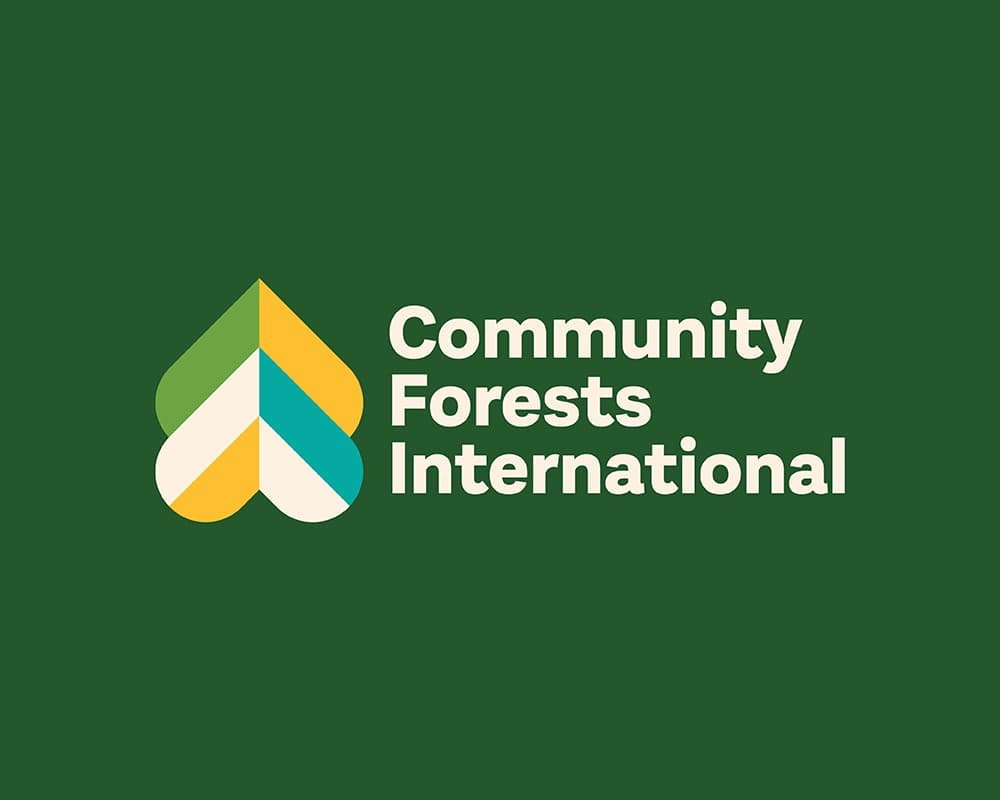
After
Cause
Climate & Sustainability
Services
Logo Design
Branding & Identity
Illustration
Details
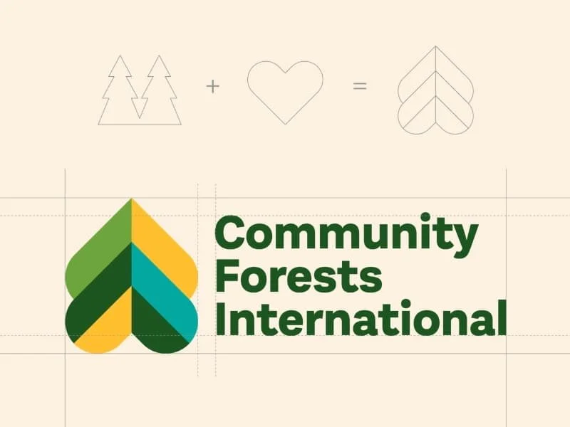
The Community Forests International (CFI) brand is a rich and thoughtful reflection of their work, as they go acre by acre enabling communities and forests to thrive together. The logo is a simple, graphic representation of this mission, and inspired by the mandate of “Leading with Love.” Cleverly constructed from two upside down hearts that come together to form a tree, the two hearts can represent both Zanzibar & Canada, as well as the hearts of people and the heart of the forest.
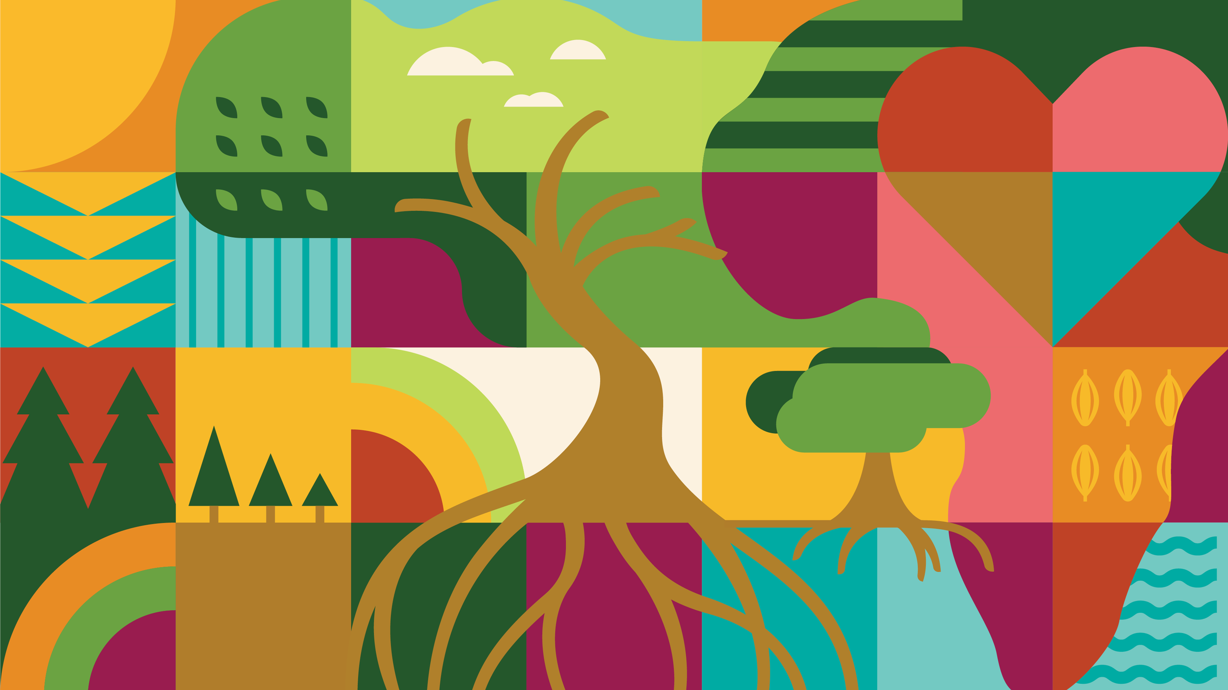
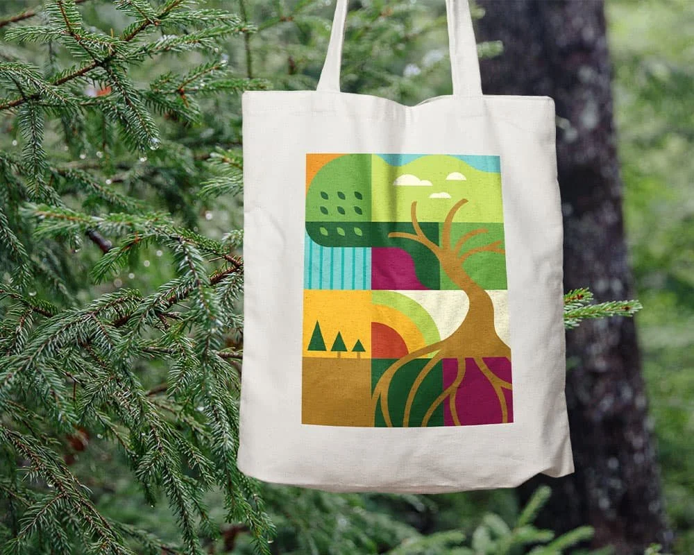
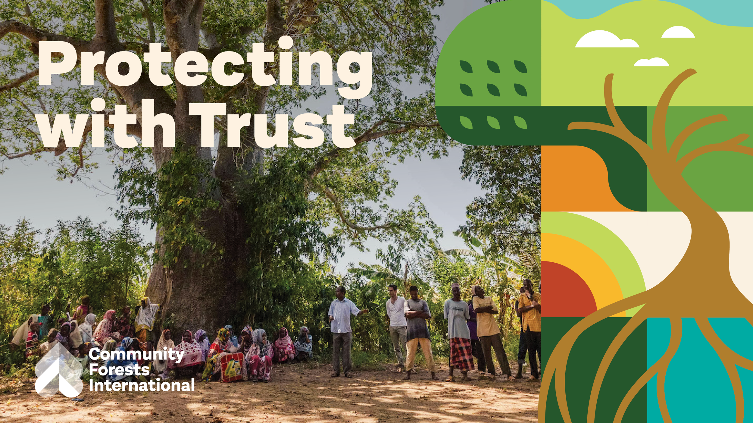
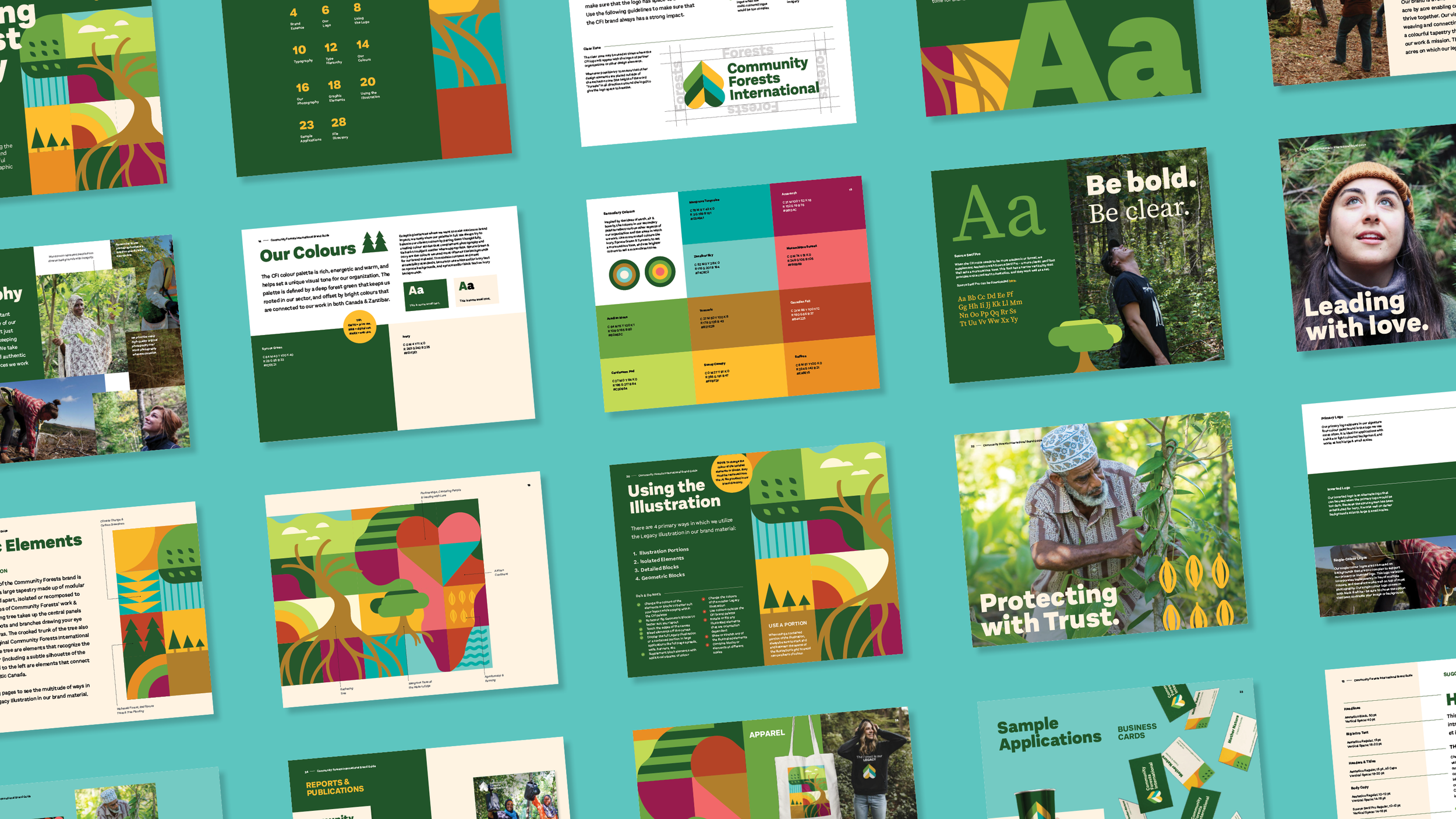
The brand’s visual language is created through the weaving and connecting of illustrated squares into a colourful Brand Tapestry that touches on many parts of CFI’s work, and these squares represent the acres on which their legacy is being built. Using a vibrant palette directly inspired by the global ecosystems where CFI works, a large gathering tree takes up the central panels of the tapestry, its roots and branches drawing the eye up and around the canvas. To the right of the tree are elements that represent the work CFI does in Zanzibar (including a silhouette of the African continent) and to the left are elements that connect with their work in Atlantic Canada. Over the years, the CFI illustration style has been applied to additional pieces of collateral including infographics, data collection, impact reports and social media campaigns, further expanding the brand’s asset directory.






Project created at Loop: Design for Social Good